Constructing Tables and Diagrams
Frequency Tables
Frequency tables are what we used to collect data. There are two main types, frequency tables and grouped frequency tables.
Here is an example of a frequency table:
This frequency table has information about the number of siblings in David’s class
| Number of siblings | Frequency |
| 0 | 4 |
| 1 | 7 |
| 2 | 10 |
| 3 | 2 |
| 4 | 2 |
We could also draw this frequency tables in a different format like this:
| Number of siblings | 0 | 1 | 2 | 3 | 4 |
| Frequency | 4 | 7 | 10 | 2 | 2 |
The type of data collected here is discrete. As siblings are people, it’s not possible to have half a person!
Finding the median:
To find the median we need to look for the middle value of our frequency and select the corresponding number of siblings. In the example above we have a total frequency of 25, therefore the median value will be between the 12th and 13th value. For this set of data the __median __value is 2 siblings.
Finding the mode: To find the mode we look for the highest frequency and the modal value will correspond to this frequency. In the example above 10 is the highest frequency and this corresponds to having 2 siblings, therefore the modal value is 2.
Finding the mean: To find the mean follow the steps below:
Step 1: Add a column frequency x number
Step 2: Total the frequency and total the frequency x number column
Step 3: Mean=Total amount / Total frequency
Eg.
| Number of siblings | Frequency | No. of siblings x Frequency |
| 0 | 4 | 0 |
| 1 | 7 | 7 |
| 2 | 10 | 20 |
| 3 | 2 | 6 |
| 4 | 2 | 8 |
Mean=Total amount /Total frequency
=41/25
= 1.64 siblings per person in David’s class
Pie Charts
To draw a pie chart follow the following steps:
Step 1: Find the total of everything and divide it by 360 degrees
Step 2: Multiply each individual frequency by the amount found in step 1 to find the angle required for each section.
Step 3:Draw a circle with a radius, measure your angles and connect.
Eg. Sarah wants to draw a pie chart showing the favourite football teams within her class. She collects this data:
| Football Team | Frequency |
| Newcastle United | 2 |
| Chelsea | 3 |
| Liverpool | 5 |
| Tottenham Hotspur | 5 |
| Other | 3 |
Total = 18
360 / 18 = 20 therefore for each amount we will need to multiply by 20
| Football Team | Frequency | Angle ( Freq x 20) in degrees |
| Newcastle United | 2 | 40 |
| Chelsea | 3 | 60 |
| Liverpool | 5 | 100 |
| Tottenham Hotspur | 5 | 100 |
| Other | 3 | 60 |
Line Graphs
To draw a line graph, plot the points of the information given and connect each dot with a straight line. Only connect the points that you have.
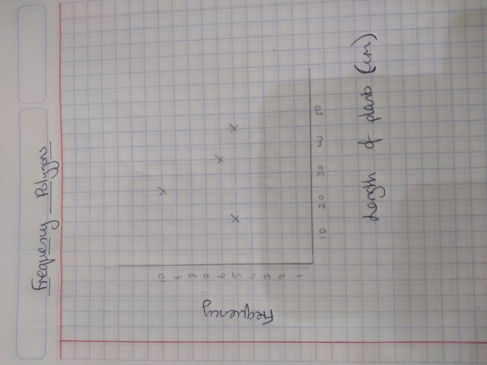
Frequency polygons
When drawing frequency polygons the key things to remember is that you plot each point on the midpoint.
For example Maddie measures the lengths of some plants
| Length of plant | Frequency | Mid-point ( you will have to add this column!) |
| 10 | 5 | 15 |
| 20 | 10 | 25 |
| 30 | 6 | 35 |
| 40 | 5 | 45 |
Cumulative frequency graphs
A cumulative frequency graph graph displays the spread of data.
The frequencies are cumulative because we add them up as we go along.
We use a cumulative frequency graph to estimate quartiles of the data.
Lower quartile= 1/4 point of the data
Median quartile =1/2 point
Upper quartile = 3/4 point.
Once we have the quartiles we can work out the:
Interquartile range = Upper quartile - Lower quartile
You will often be expected to work out the interquartiles from your cumulative frequency diagram.
How to draw a cumulative frequency graph:
- Add another column to your data and label it cumulative frequency
- Add the first + second + third…. Values each time to complete the cumulative frequency
- Draw a graph with cumulative frequency on the y axis
- Plot each point using the upper limit of each class (eg. if you had a width 5< t< 10 you would plot on the 10)
- Join the points in pencil with a smooth ‘S’ shaped curve
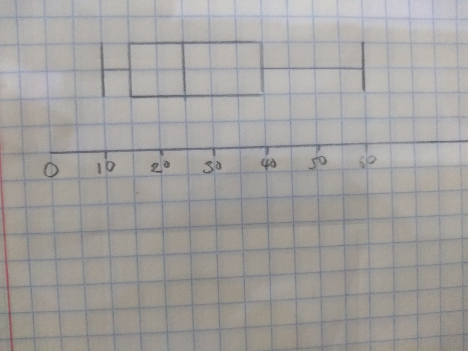
Box Plots
Boxplots, like cumulative frequency diagrams help us see how our data is spread out. To draw a box plot you need to know the highest value, lowest value, medium, lower quartile and upper quartile.
How to draw a Boxplot:
Step 1: Draw a scale
Step 2: Plot the lower quartile, median and upper quartile
Step 3: Join the points to create a box
Step 4: Connect the box with a line to the highest value and the lowest value ( these are often known as the ‘whiskers’ of the box plot’
Eg. Here is some information about test scores:
Highest value = 60
Lowest value = 10
Lower quartile = 15
Medium = 25
Upper quartile = 40
Draw a box plot to show this data.
- What is the general formula to find the mean from a frequency table?
- Your answer should include: Total Amount / Total Frequency
- When drawing a frequency polygon where do you plot the points on the x axis?
- Midpoint
- When drawing a cumulative frequency graph where do you plot the points?
- Upper Bound
- When drawing a histogram what is the key formula?
- Your answer should include: Frequency Density / Frequency / Class Width