Interpreting Data
Interpreting Graphs
When it comes to interpreting graphs we can tell a lot about the data, and the spread of the data just by looking at the graphs.
Histograms
Below are two histograms showing the weight of plant type a and plant type b.
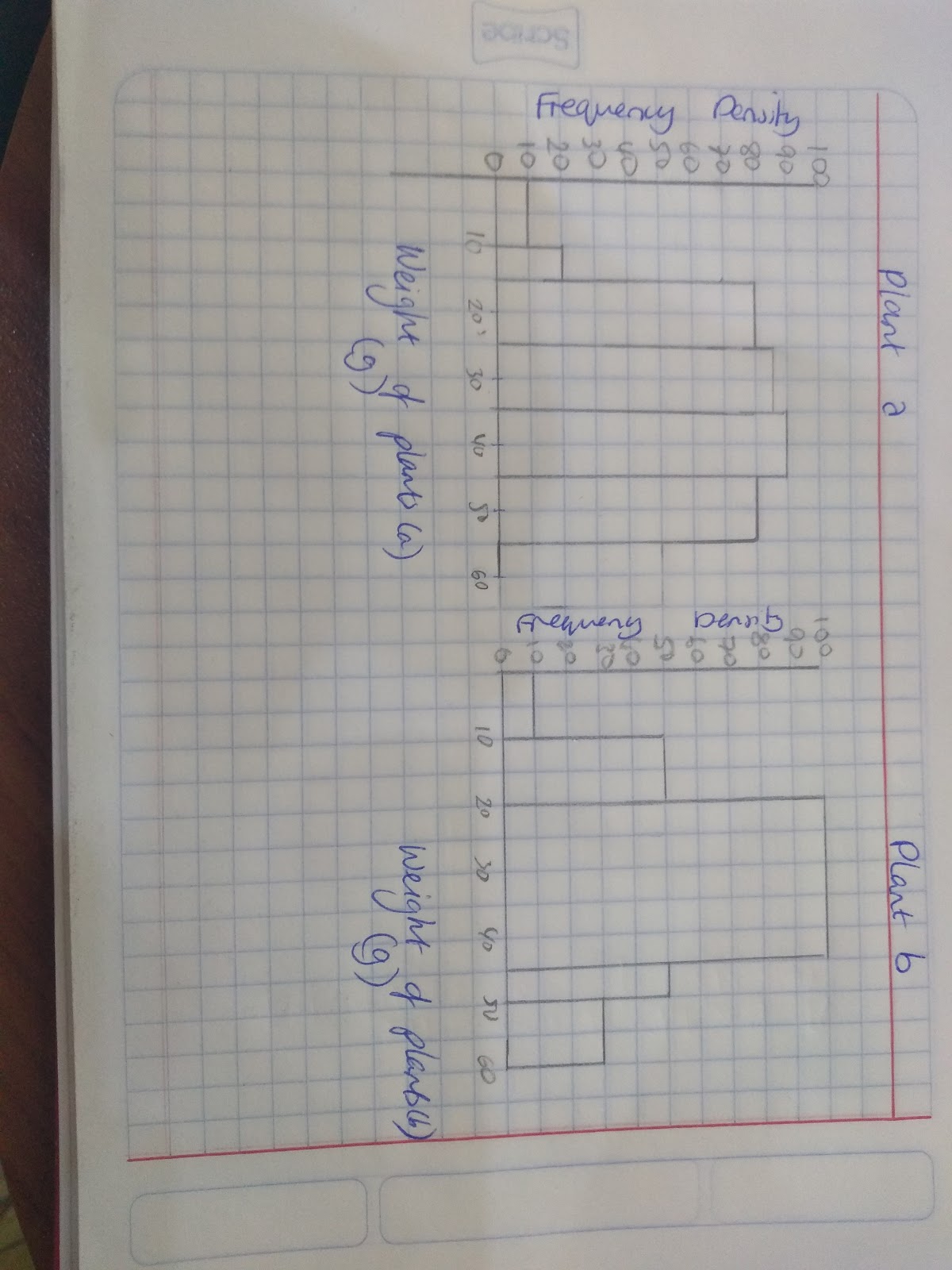
Plant type a shows a high dispersion- a large spread of results away from the mean. It shows that the results are not close together there is a lot of variation within the data.
Plant type b shows a distribution that is closer to the mean, this means that most of the results are within a narrow range, there is less variation within the data.
Analysing the Cumulative Frequency Curve
To analyse the cumulative frequency curve think about how it relates to the interquartile range.
The steeper the curves will show a small interquartile range, whilst gentler gradients indicate a wider interquartile range.
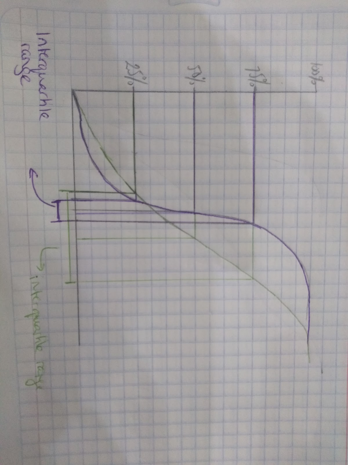
Eg. The purple curve is alot steeper and has a very small interquartile range which means the values in the data are close the the median. Whilst the green curve has a larger interquartile range which means the values are more evenly distributed.
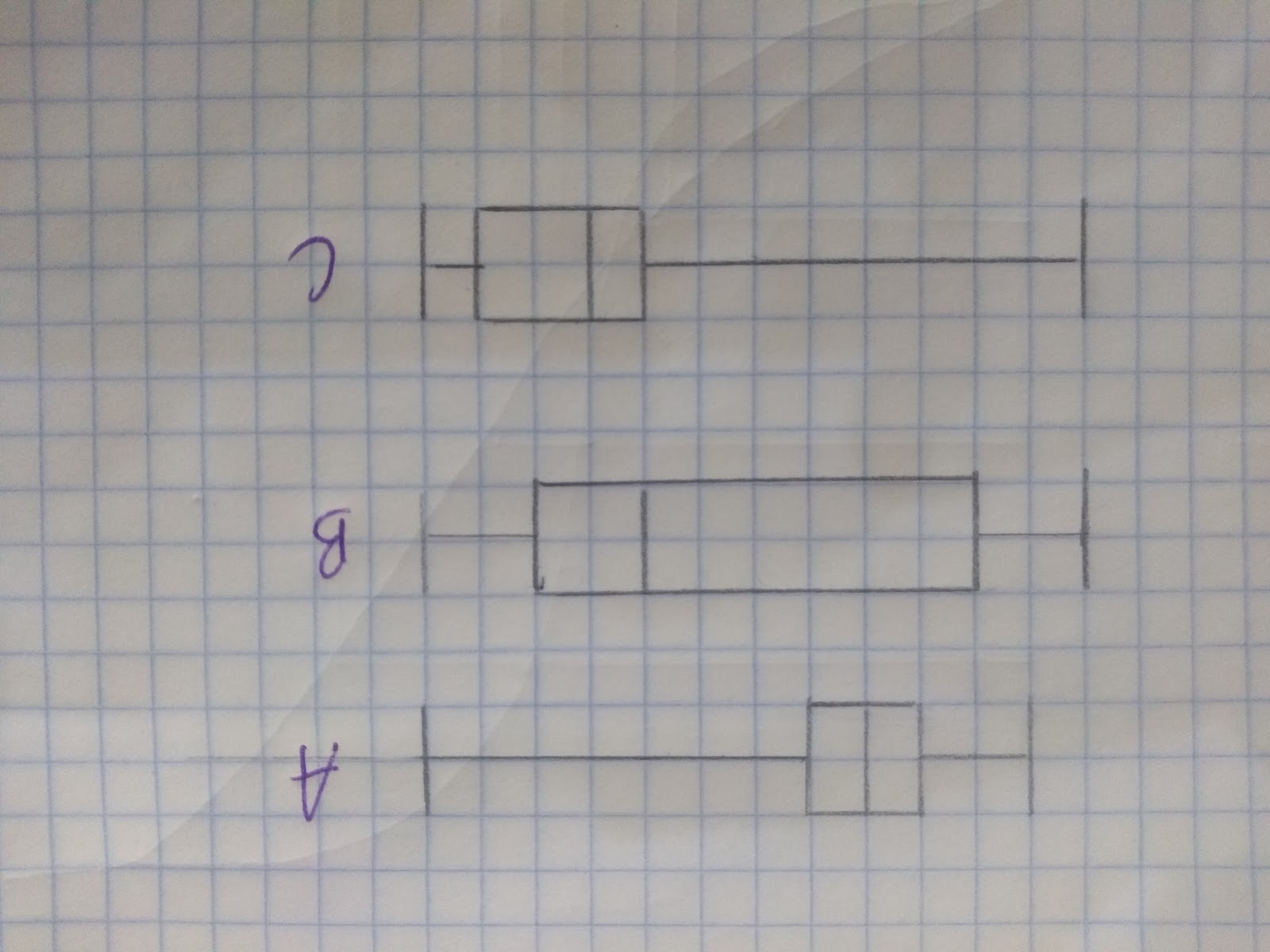
Analysing box plots
When it comes to box plots we are able to visually see the difference in spreads between data sets.
When analysing a box plot make sure you compare:
- The interquartile range
- The median
For example if you wanted to compare these box plots it would be worth mentioning:
Boxplot A:
- Has a symmetrical lower and upper quartile because the median is exactly in the middle of the box.
- The interquartile range is small, which tells us that there is not a large spread between the data points.
Boxplot B:
- Has a large interquartile range which means there is a large spread of the data.
- The median is closer to the upper quartile than the lower quartile.
Boxplot C:
- The interquartile range shows that most of the data is close to the highest value.
- The median is closer to the lower quartile than the higher quartile
- How do you work out the interquartile range?
- Your answer should include: Upper Quartile / Lower Quartile
- What does a large range tell you about a set of data?
- Spread
Measures of central tendency
To analyse graphs (and data more generally) you want to look at:
- The averages (mode, mean and median)
- The spread of the data (the range and the interquartile range)
The averages or measures of central tendency tell you different things about the data:
- Mode: This tells you the most common or most frequent data point (look for the most frequent value).
- Median: This tells you the middle point in the data (imagine lining things up in size order and picking the middle value)
- Mean: This takes into account all the data points and gives you an average of those points. (Total Total number of things). Take care with the mean- if you have a couple of points that are very high or very low, this can have a large impact on the mean!
Measures of spread:
The Range: Biggest value- smallest value
This tells you the difference between the highest value and the lowest value. It tells you how spread out the data is. Therefore if you have a large range it means that there is a big difference between the highest and lowest value.
The Interquartile range: This tells you about the range within 75% of the data. It discounts the highest quarter and the lowest quarter. This means it tells you more about how the data around the median is spread.
- What does a large range tell you about a set of data?
- Spread Out
- How do you work out the interquartile range?
- Your answer should include: Upper Quartile / Lower Quartile
- What two things should you compare when looking at boxplots:
- Your answer should include: Interquartile Range / Median