Scatter Graphs
Drawing scatter graphs
Steps to draw a scatter graph:
Step 1: Draw an axis and plot points
Step 2: Draw a line of best fit. Aim to get the line half way between the points or at least an even amount of points on each side.
Interpreting scatter graphs
The keyword associated with scatter graphs is correlation.
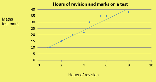
Positive correlation means that as one variable increases the other variable increases.
Eg.
Hours of revision and exam marks.
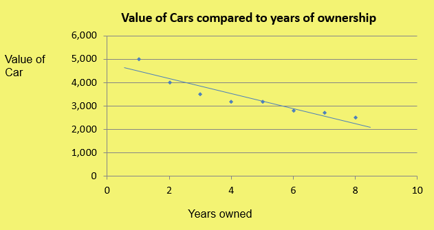
Negative correlation means that as one variable increases the other variable decreases
Eg.
Price of a car and time (cars decrease in value very quickly!)
Strong correlation means that the points are very close together
Weak correlation means that the points are quite far apart
No correlation means the points are spread out randomly and therefore the variables do not show any relationship.
In this case, the graph shows the number of biscuits eaten and the marks on a test:
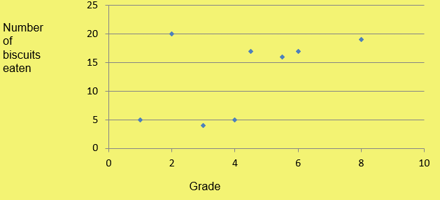
TAKE CARE! __Just because two variables show positive correlation it __does not __mean that one variable __caused another. For example, Kirsty might find positive correlation between the number of biscuits she eats and her maths exam marks. However Kirsty’s maths has nothing to do with the number of biscuits she eats!
Line of best fit
The line that goes through the points, or at least tracks them as evenly as possible, is called the line of best fit.
This line can be used to help estimate answers or make predictions.
To do this:
Step 1: Draw a line of best fit
Step 2: Using the other variable draw a line up to the line of best fit and another line to read off the new value
Step 3: Check that you have read your scale correctly.
Eg. A student misses their maths test, but got a score of 14 in their English test. Predict their maths mark.
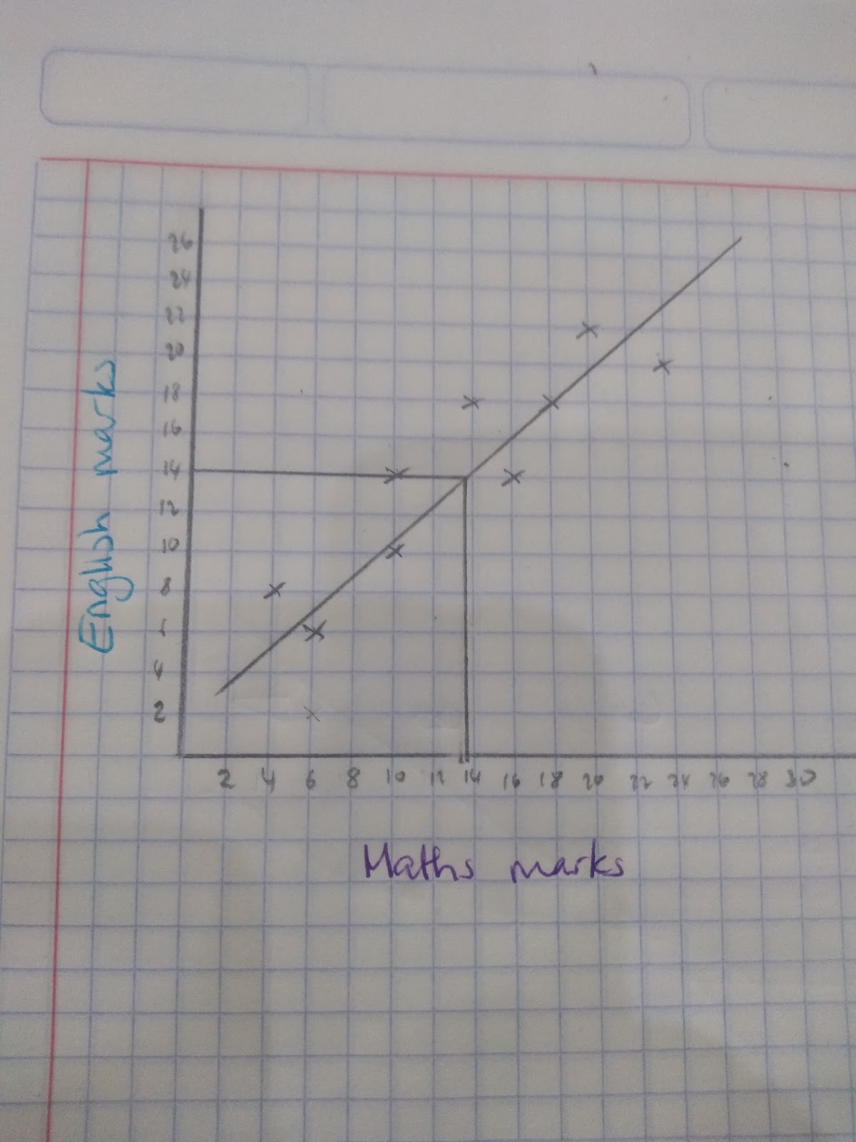
Using the line of best fit we can estimate an answer of 13.5 in the maths exam.
Interpolation
Interpolation is when we make a prediction for a value that within the same range as the data that we already have.
Extrapolation
Extrapolation is when we make a prediction for a value that is outside of our range.
Extrapolating values presumes that the relationship between variables continues and therefore predictions that involve extrapolating the data are not reliable.
For example, in the scatter graph below if we ended the values it would assume that the older the baby gets the heavier they get, however if we think about a baby when they turn into an adult that is not the case! We don’t continuously keep getting heavier!
- True or False: When two variables show positive correlation it means one variable has caused another one?
- False